Note: This is Activity 2 of the water cycle lesson for grades 3–5.
Purpose: To appreciate the difference in the amount of precipitation between rainforest regions and students’ location.
Materials: Access to the Internet, pencil, recycled sustainable notebook paper, graphing paper, poster board, markers, crayons, tape, and scissors.
Procedure:
- Students can search: www.weather-and-climate.com and type in their local city (or nearest city) and a rainforest country (city) for information. This website has excellent graphs on the amount of precipitation, temperature, and hours of sunlight (monthly scale). You can decide as a class which factor you would like to focus on (precipitation, temperature, hours of sunlight) and which rainforest region(s) to explore. For example, a class in San Francisco may be interested in comparing/contrasting the amount of precipitation they receive every month compared with how much Madagascar (Toamasina) receives monthly (see example below).
- If students are interested in exploring other regions, allow them the choice and freedom to do so. Our class decided to break out into four regions with each region comparing/contrasting the amount of precipitation in Wastonville with the amount of precipitation in Group 1: Borneo (Tarakan); Group 2: Brazil (Manaus); Group 3: Congo (Kisangani); and Group 4: Madagascar (Toamasina). Each group co-constructed a poster with a table (for organizing their data) and a bar graph (for representing their data). Pictures of students’ posters can be found in the students’ work folders, in addition to their worksheets.
Precipitation table
| Month | Rainforest region | Students’ location |
| Jan | ||
| Feb | ||
| Mar | ||
| Apr | ||
| May | ||
| Jun | ||
| Jul | ||
| Aug | ||
| Sept | ||
| Oct | ||
| Nov | ||
| Dec |
Note: See example of precipitation tables, graphs, and questions below
Table 1. Monthly precipitation
| Month | Rainforest region | Students’ location |
| Toamasina, Madagascar | San Francisco, CA | |
| Jan | 410 mm | 112 mm |
| Feb | 380 ~ | 83 ~ |
| Mar | 480 ~ | 79 ~ |
| Apr | 330 ~ | 37 ~ |
| May | 240 ~ | 8 ~ |
| Jun | 270 ~ | 5 ~ |
| Jul | 290 ~ | 2 ~ |
| Aug | 240 ~ | 2 ~ |
| Sept | 130 ~ | 9 ~ |
| Oct | 150 ~ | 35 ~ |
| Nov | 180 ~ | 75 ~ |
| Dec | 360 ~ | 80 ~ |
Measurements estimated from a graph on www.weather-and-climate.com
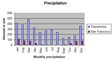
Graph 1. Monthly precipitation
Calculating data for Table 2. Mean, median, and mode precipitation values.
Mean: Sum of values/divided by number of values. For example, the sum of the Toamasina precipitation values is 3460 (Table 1 has monthly values). Now, take the sum and divide by the number of values. There are 12 values, each representing the amount of precipitation for each month. 3460/12 = 288.3 or 288 mm
Median: Order the values from smallest to largest, then choose the middle number. If there is an even number of values, like 12, which is the case here, take the two middle values and average them. For example:
130, 150, 180, 240, 240, 270, 290, 330, 360, 380, 410, 480
Can you see that these ‘270’ and ‘290’ are in the middle? There are five numbers to the left, and five numbers to the right. Now, take the average of these two values: 270 + 290 = 560, then divide the sum 560 by the number of values added (which, in this case is just two, 270 and 290).
560/2 = 280 mm
Note: If the number of values you added is an odd number, like 11 instead of 12, it’s much easier to find the median because it’s just the middle number:
130, 150, 180, 240, 240, 270, 290, 330, 360, 380, 410
Mode: The mode is a number that has the highest frequency in the data set, meaning the same number is repeated the most within the data set. In this case, that number is 240 mm since it is the only value that appears twice. Sometimes data sets do not have modes.
Now that you know how to calculate the mean, median, and look for the mode, you can organize these knew values into another table, for example, (see below).
Table 2. Mean, median, and mode precipitation values
| Toamasina, Madagascar | San Francisco, CA | |
| Mean | 288 | 44 |
| Median | 280 | 36 |
| Mode | 240 | 2 |
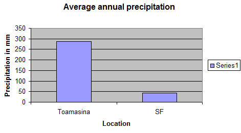
Wow! When you compare the mean, median, and mode, the differences are very apparent. When comparing the means, it is apparent Toamasina receives a little over 6 times the amount of rain San Francisco receives (44 x 6 = 264 mm). That’s a lot of rain! The graph below also demonstrates this striking difference. This is the power of organizing data into tables and graphs. Differences or lack of difference are much more noticeable.
Graph 2: Mean annual precipitation
Questions:
- Which region has more precipitation year round?
- What is the range of precipitation for each region:
Toamasina, Madagascar low- high
San Francisco, CA low- high
- When you compare the ranges, can you appreciate the difference in the amount of precipitation Toamasina gets compared to SF?
- Can you provide reasons why Toamasina gets significantly more rain compared to SF even though they are both coastal cities.
- Which month received the most rain in Toamasina and which month received the least? Did you know that the wettest month in Toamasina is March and the driest month is September? Do these facts match the data in the table and graph?
- Which month received the most rain in SF and which month received the least? Does the data match with seasons?
Note: Dec-Mar: Winter
Mar-Jun: Spring
Jun- Sept: Summer
Sept-Dec: Fall
- Do you think the graph, i.e., Graph 1, is an appropriate one to use to represent the data in Table 1? Explain your answer.
- Which measure is more accurate: mean, median, or mode. Explain why?
- What do you think about organizing data into tables and graphs? Do you think it is helpful? Why or why not
Answers:
- Toamasina, Madagascar
- Toamasina: low-high is 130-480 mm
SF: low-high is 2-112 mm
- Yes! In fact, SF high (112 mm) is still lower than Toamasina’s low (130 mm).
- Because this region in Madagascar is on the eastern side of the country when looking at the satellite map on www.mongabay.com, there appears to be a lot of green and cloud coverage. We know that trees transpire water (plant leaves release water into the atmosphere) and cloud coverage is an indication of moisture held within the atmosphere (condensation).
- Most rain in Toamasina is in March
Least rain in Toamasina is in September
Yes, the data matches the facts: Wettest month is March; driest is September
- Most rain in SF is January
Least rain in SF is July and August
Yes, the data matches with our seasons, i.e., January is a winter month and July and August are summer months
- Graph 1 is an appropriate one to use because we are comparing precipitation (one variable) with two regions (Toamasina, Madagascar and San Francisco).
- The mean is a more accurate measure because when calculating the mean, all of the monthly precipitation values are taken into account, rather than just relying on one or two when calculating (or estimating) the median. The median measure is more of an estimation of the average, rather than a true average.
- Yes! Differences or lack of differences become much more apparent when data is organized in tables and graphs. Patterns are also much easier to recognize.
Precipitation data/questions for several rainforest regions:
Completed Student Examples :
3rd Grade :
4th Grade :
Madagascar Precipitation Graph
5th Grade :

